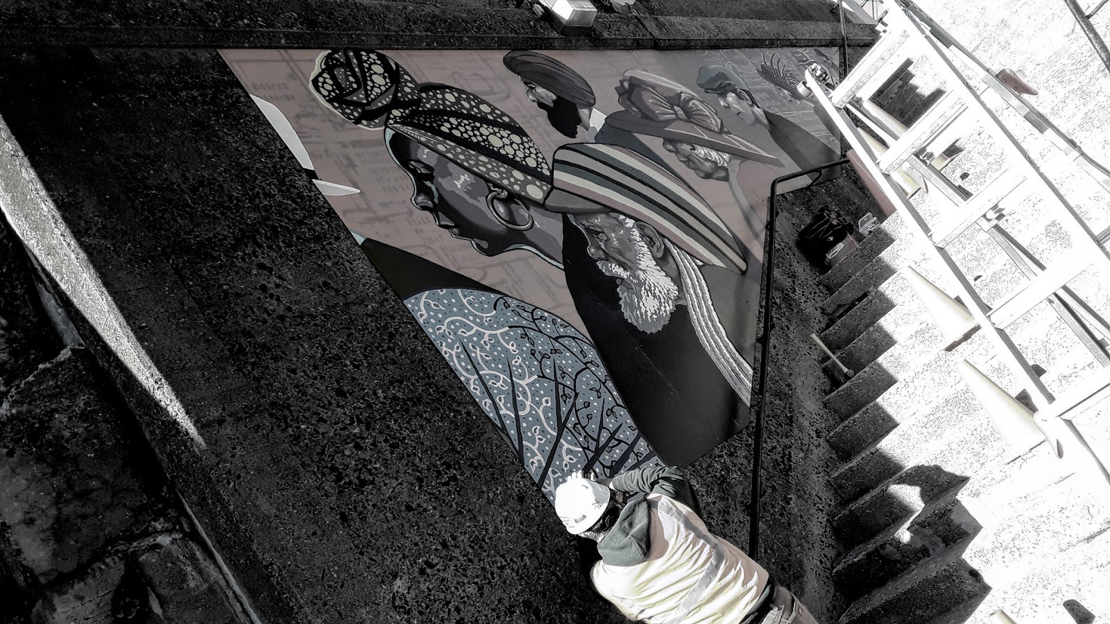
After developing a concept, producing a scale gouache study, writing a proposal, there is the tiny matter of actually painting a mural.
NJTransit has a policy of not allowing artwork to be painted directly onto their concrete, for reasons of historic preservation. This turned out to be a blessing, really; the historic concrete in this case has a high relief texture to it, with rocks and pebbles the size of hamsters surfacing throughout.
With lots of input and options from Custom Sign Source and Valley Arts, my wife Denise and I came up with the following process:
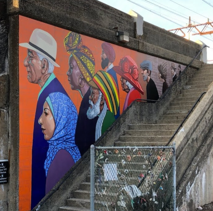
• Break down and recomposite the artwork to fit the precise measurements of the stairwell, based on 4 ft. x 10 ft. aluminum composite sign panel dimensions, keeping the faces away from any seams.
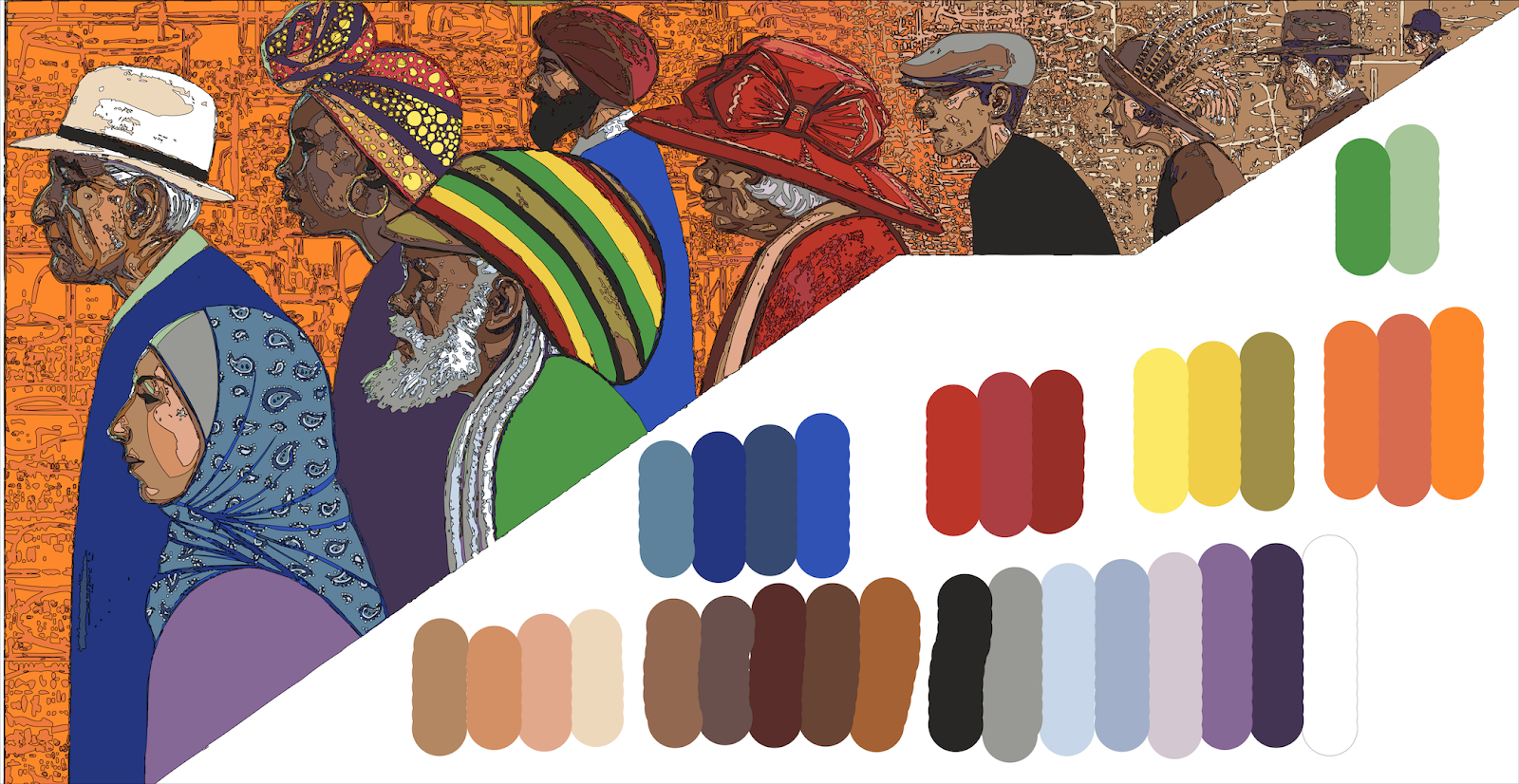
• Create color separations and a working palette from the gouache painting.
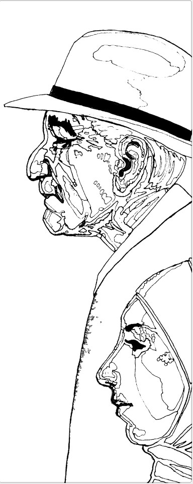
• Convert the color separated art to linework, then convert the linework to an Adobe Illustrator file.
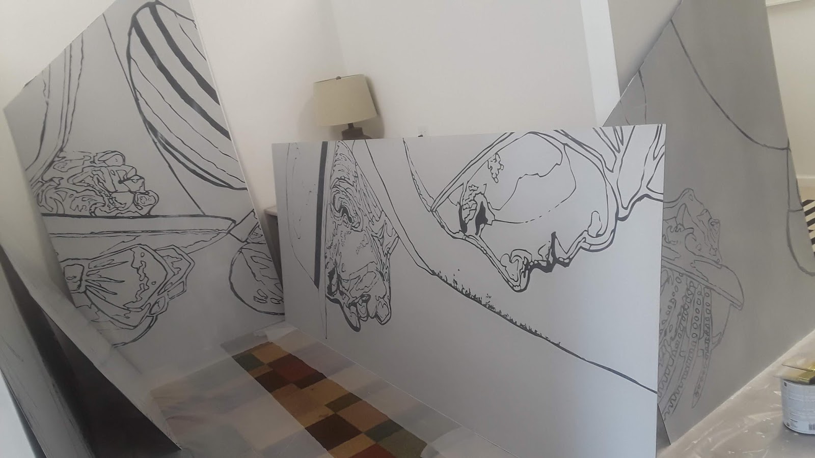
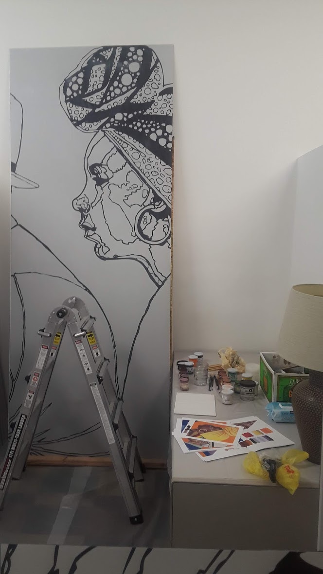
• Have the line work printed onto the composite panels. While the sign panels have a smooth enamel surface, printing a 30-40% gray behind the art creates a sandpaper-like tooth to the surface, making it more conducive to painting.
• After printing, we coated the panels with XIM Brand urethane modified acrylic (UMA) primer/bonder/sealer.
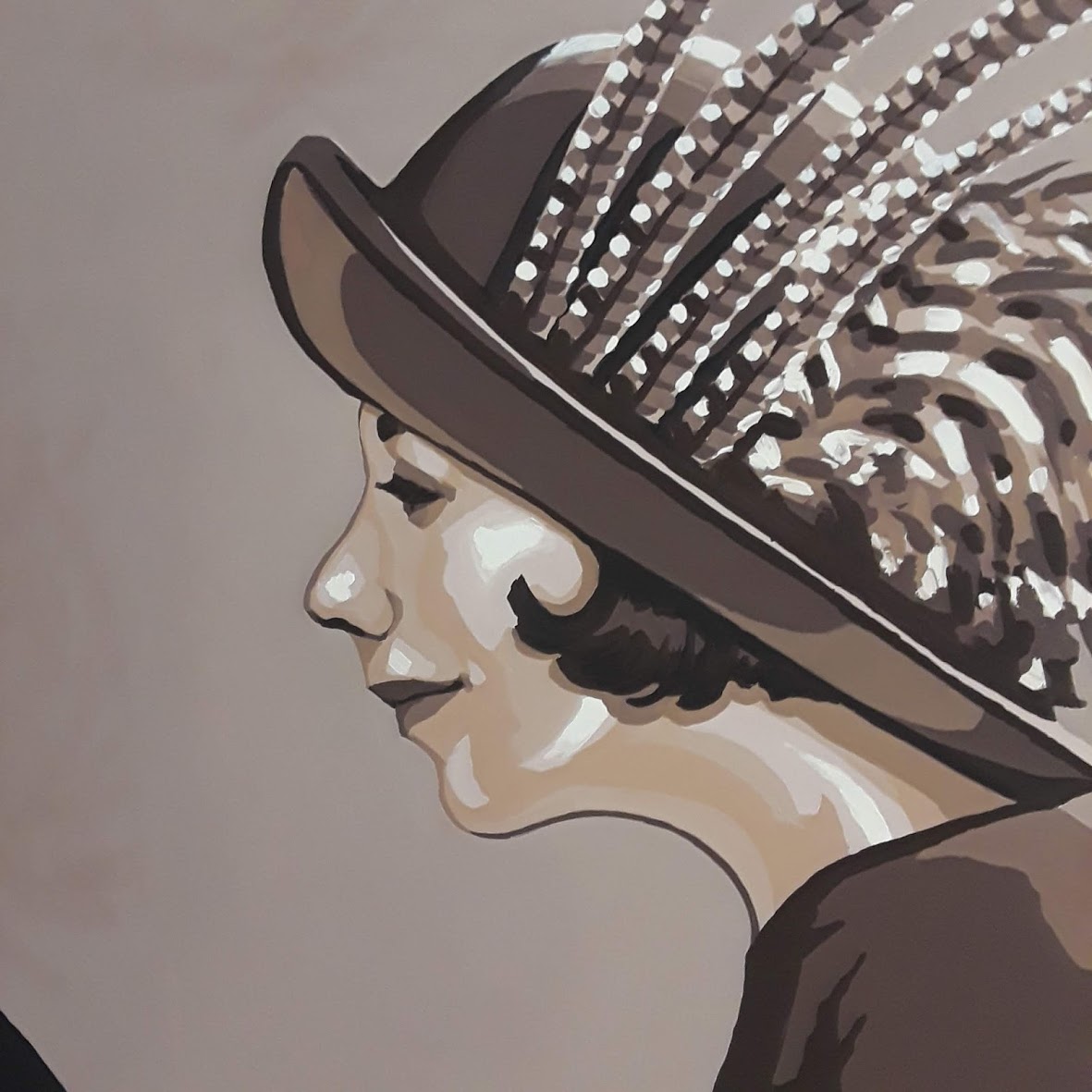
• Premix as much of the palette as possible. We used Lefranc & Bourgeois Flashe vinyl paint, which dries to a satin, gouache-like sheen, with really nice leveling properties; also it preserves the appearance or brushstrokes, the surface texture dries nearly flat. This allows it to catch light evenly throughout the day without any streaking shadows or divets as the sun passes east to west in the southern sky.
• Apply a UV protective varnish (in this case, Golden’s MSA Satin Varnish) to protect any fugitive colors from fading in the sun, and to facilitate future cleaning and maintenance. The varnish requires a gloss “isolation coat” between the varnish and the paint surface, and the satin finish returns the colors to their soft matte, gouache-like sheen.
And now, all of that again, but with pictures…
1- Break down and recomposite the artwork to fit the precise measurements of the stairwell, based on 4 ft. x 10 ft. aluminum composite sign panel dimensions, keeping the faces away from any proposed seams.


2- Create color separations and a working palette from the gouache painting.
3- Convert the color separated art to linework, then convert the linework to an Adobe Illustrator file.

4- Have the line work printed onto the composite panels. While the sign panels have a smooth enamel surface, printing a 30-40% gray behind the art creates a sandpaper-like tooth to the surface, making it more conducive to painting.
5- After printing, we coated the panels with XIM Brand urethane modified acrylic (UMA) primer/bonder/sealer.
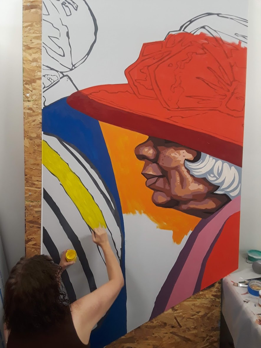
6- Premix as much of the palette as possible. We used Lefranc & Bourgeois Flashe vinyl paint, which dries to a satin, gouache-like sheen, with really nice leveling properties; also it preserves the appearance or brushstrokes, the surface texture dries nearly flat. This allows it to catch light evenly throughout the day without any streaking shadows or divets as the sun passes east to west in the southern sky.
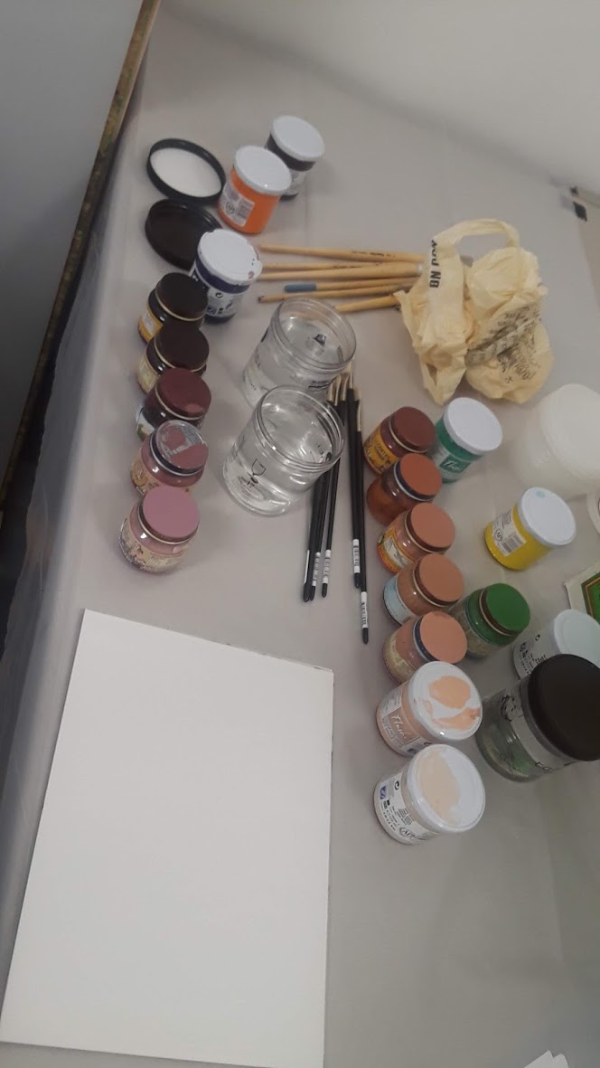
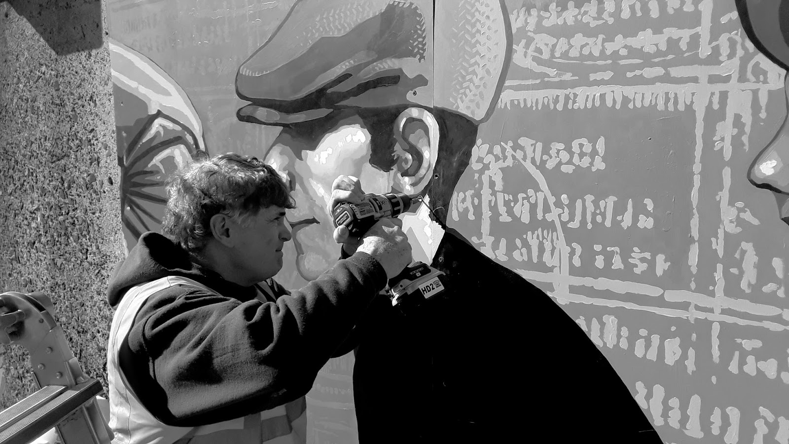
Baby food jars are perfect for holding deceptive amounts of mixed paint.
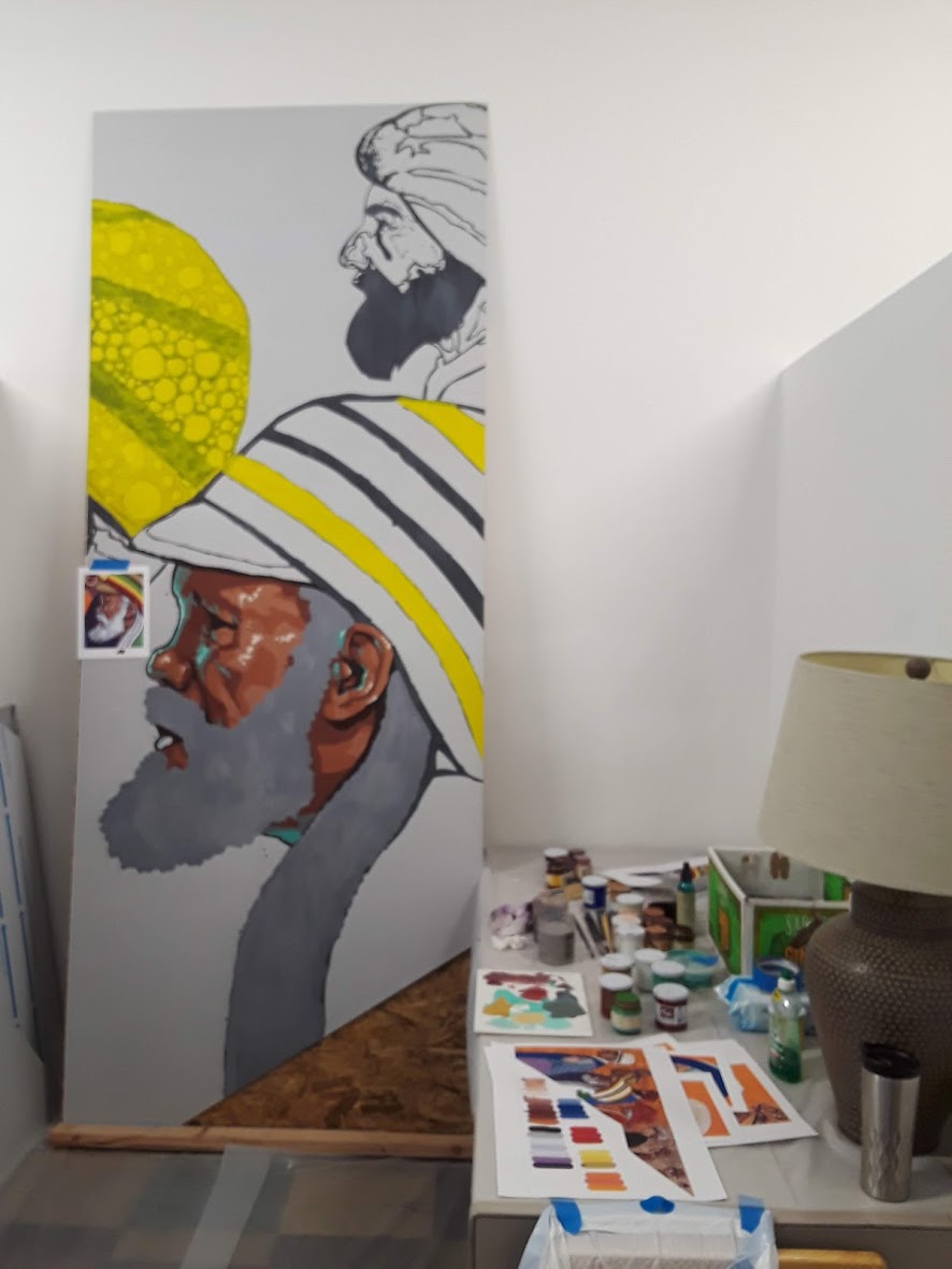
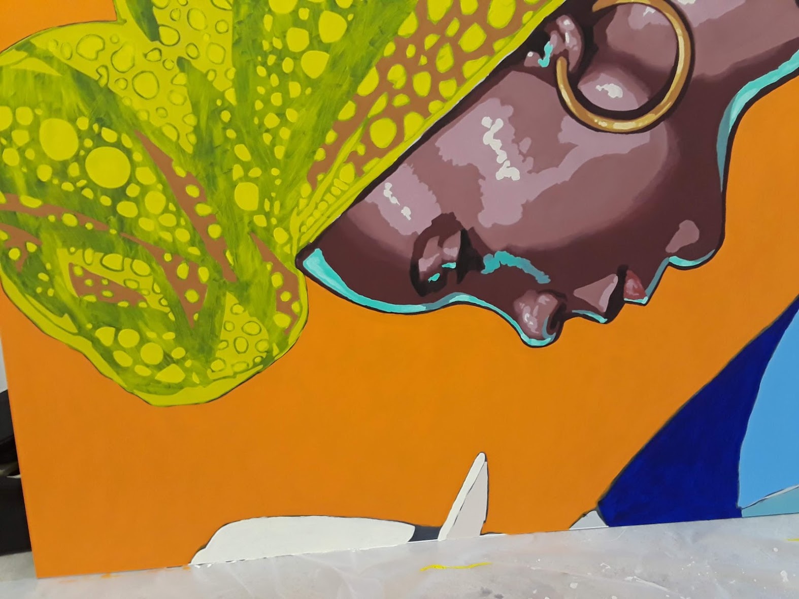
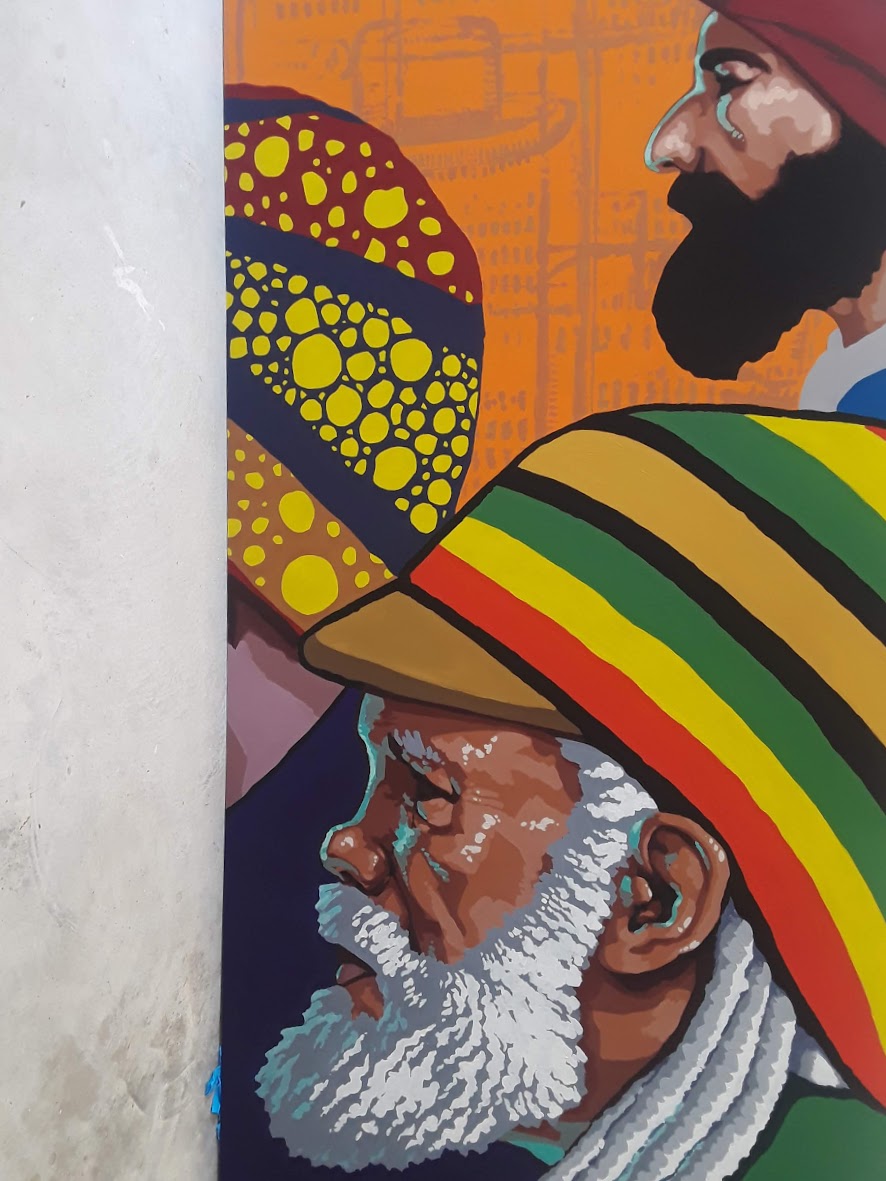
A note about pigments: in the world of non-toxic colors, there are very few truly opaque colors. In some cases, we addressed this with multiple coats of paint. In others, we painted in the necessary values, then glazed the local color over, before working in highlights and accents. The lack of opacity, as a plus, also meant that it was easy to keep the drawing visible until we were sure we were done with it.


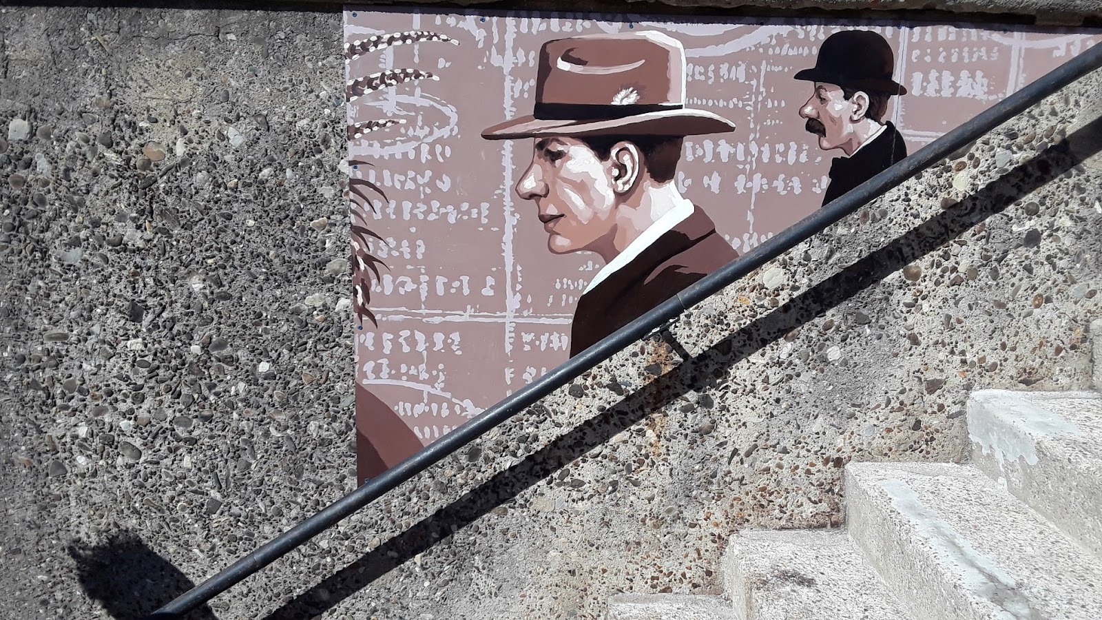
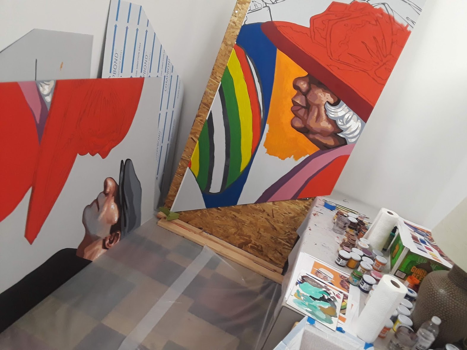
From a technique standpoint, most of the surfaces were painted from dark up to the midtone, with the modeling and highlights—as well as the deepest recesses—painted over top.
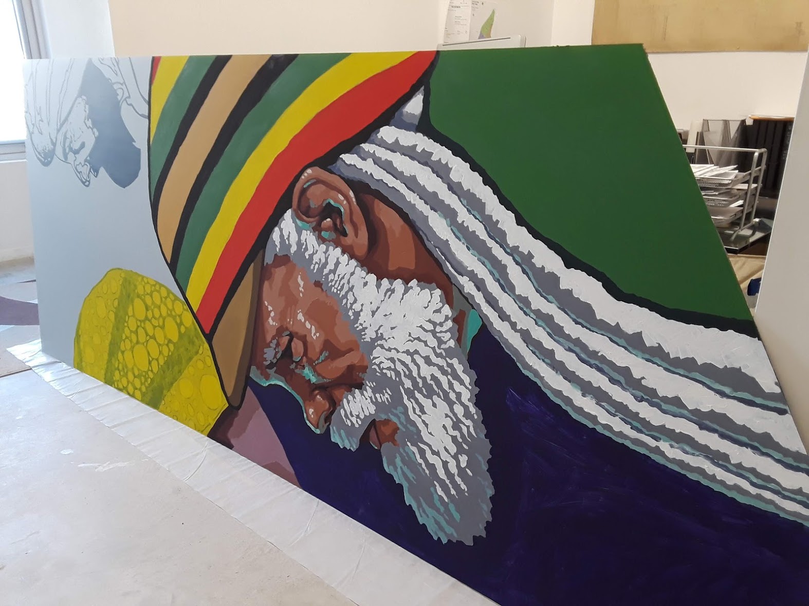
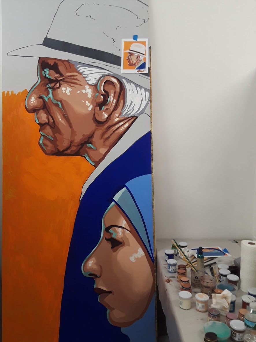
Denise loves following directions. I don't. Denise loves coloring in the lines. I can't. In this way, we make a surprisingly good team. She took on large flat areas and tightly organized patterns, I handled all the portraits and any areas of improvisation; when enlarging a 20 inch study to over 30 feet, there can be quite a bit of wiggle room in the translation.


7- Apply a UV protective varnish (in this case, Golden’s MSA Satin Varnish) to protect any fugitive colors from fading in the sun, and to facilitate future cleaning and maintenance. The varnish requires a gloss “isolation coat” between the varnish and the paint surface, and the satin finish returns the colors to their soft matte, gouache-like sheen.
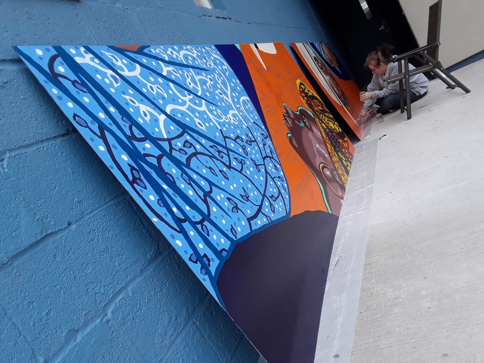
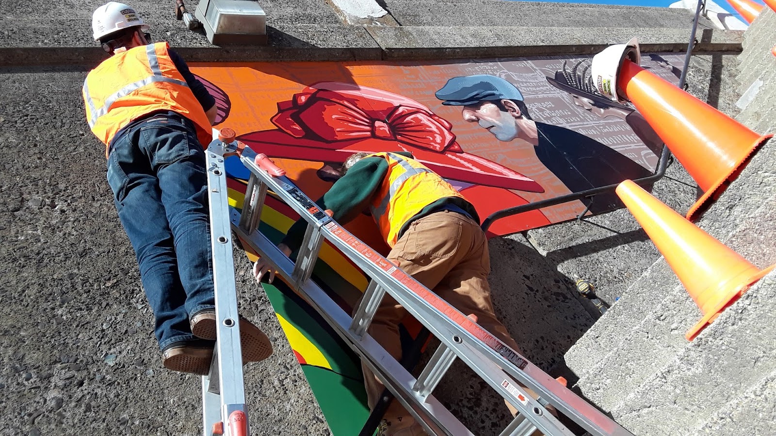
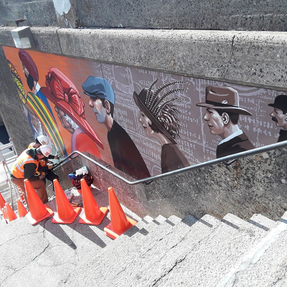
And then, it's off to the installation! (I'm skipping over several months of NJ Transit protocol wrangling and painting storage.)