Thursday, December 20, 2012

The semester in demos

A selection of one hour oil painting demos from this past Fall semester at the University of the Arts.

Various supports (paper, canvas...),
various sizes,
various levels of success...


Wednesday, November 14, 2012

What do Pete Mitchell, Bryan Ballinger, Doug Bell, Adam Gustavson, Roger Cruz, Karen Jones Lee, Jeremy Vanhoozer, Josh Addessi, Janee Trasler, Paul Conrad, Chuck Vollmer, Cole Phillips, Wout Schildermans, Lilian Carmine, Sarah Bodnar, Micah Lanier and Andi Butler all have in common?


I'm glad you asked. Why, they're all featured in the comic anthology Dead Anyway, a charming and virtually bottomless assortment of zombie stories.

And it's available for pre-order HERE.

Cute zombies! Fairy zombies! Carny zombies! Child zombies! Culinary reality show zombies! Zombie stories of love, loss, redemption and even the occasional western.

And, of course, existentialist zombies. Here's page one of my contribution the pantheon.

 13 x 19 inches. Pencil and gouache on paper, 2012.

Wednesday, November 7, 2012

Hey! It's a mini interview with life sized me.

Care of the fabulous Molly Idle.  Wherein I expound on questions about the creative process, style, and the five words that describe me best.

Read the whole shebang here. The word here, that is. Just in case you thought it was here on this blog somewhere, which it's not. It's here.

To lure you in, here's a new image from a new title spoken about therein. And when the book comes out, there'll be 34 more where that came from...

From Rock and Roll Highway: The Robbie Robertson Story, by Sebastian Robertson. 
Christy Ottaviano Books, 2014.

Monday, October 1, 2012

I love the smell of a new review in the morning.

The folks over at kid-lit.com  have issued an attentive and rather sparkling review of my latest book, Lost and Found, written by two-time Grammy winner Bill Harley. The review can be found in its entirety here...

...with a lively interview with Mr. Harley accompanying it here...

In the mean time, here's another lovingly crafted image from this newly released title.


Thursday, September 27, 2012

Go get 'em, Tiger.

My 20th high school class reunion is this weekend. I've been asked in the most flattering way possible to create something for the event's dinnertime raffle, which I assumed meant a drawing or painting and not crocheted potholder. I'm hoping this is the case, as I've never crocheted before.

So after some internal mulling over pictorial options, I settled on this.

He's my high school mascot.

Last time I saw him, he was, like, big and awesome and strong and fast. Always snarling, or haughtily prancing about. He had a closet full of sports jerseys, as far as I could figure.

But it's been 20 years. I'm sure he's still roaring and prowling on the inside.


oil on canvas, 12 x 16 inches

Friday, September 14, 2012

Beatnik Turtle.

With thanks to my dear agent, Abigail Samoun, for requesting the theme.

The beatnik thing, that is. For some reason, the turtles just came to me. I mean, who doesn't just think about turtles?


Saturday, August 11, 2012

Out on a Linseed Oil Bender

So yes, I'm finishing up work on a book project for a sizable non-profit public outreach organization. The deadline has been a little tight; from initial pagination, sketches and on to finished oils the turnaround will top out at around a month and a half. Just for comparison, the usual time frame for a project of this scale (33 illustrations total, including spots, full pagers, spreads and cover) would be between 6 and 9 months.

It's been a bit of an adventure, but aside from the time constraints, said client has been among my most relaxed and trusting. And, as I mentioned before, they let me paint mismatched Lego people doing battle. So really, no complaints.

It's also led me to a rumination or two on some of the artistic challenges of illustration. Namely, aside from its end goal of communication of some point, concept, narrative or all of the above (as opposed to obfuscation, of course), illustration requires one to find imagery where one might not have otherwise looked or found inspiration, and to compose it in way that is compelling while still serving its source material, in this case a manuscript with a clearly defined philanthropic goal.

That, and in a forty page book, one has to thoughtfully pick out clothes for everyone.

Needless to say, while working on this, I've made little or no effort to pick out clothes for my own children. I should probably go make sure they've changed out of their pajamas.

Maybe Wednesday.


Friday, August 10, 2012

Monday, August 6, 2012

Upcoming from Christy Ottaviano Books

Here's a small peak into the project I've been working on for most of the year, Rock and Roll Highway: the Robbie Robertson Story, by Sebastian Robertson.  It's due out from Christy Ottaviano Books (an imprint of Holt) in Fall of 2013.


Oil on Paper, 2012.  19 in. x 27.5 in.

Saturday, August 4, 2012

The Summer in (mostly) Mass Transit Sketches

Maybe it's worth noting that I'm left handed.  I bring this up only as a bit of clarification; to avoid perching my drawing hand on a metal spiral, my sketchbooks are all backwards. I've been using the same brand and scale since Fall of 1997 with only a few exceptions. The covers all look sort of like this:


The insides often look like this. I do an awful lot of my sketching in places where people are happy to ignore their close neighbors.


pen on recycled paper, 5" x 7"

Tuesday, July 24, 2012

Morning warm up.

 
Oil on canvas, 12" x 18" 
2012

I should probably go get that second cup of coffee.

Friday, July 6, 2012

It's what the cool kids were doing.

Over at Red Fox Literary, we've commenced with a little bi-weekly adventure, assigning ourselves a theme to inspire the making of some art, specifically some art that's not the job we're working on that particular week. This is really nice, as I'm right in the midst of a few projects that I'm not allowed to release anything from yet.

So that said, this image is confirmation that I'm still both alive and working as an illustrator.

Oh, and the theme was "summer."  Gouache on paper, 11" x 15".

Saturday, June 23, 2012

In the (not Greenwich) Mean Time.

I'm currently neck deep in book projects, really exciting ones, actually, for which I'm contractually forbidden from posting any images at this time. When industry legal teams say "we'd prefer you not leap at this moment in time," well, far be it from me to ask "how high?" No, no, I contentedly stand around.

So in lieu of any new paintings, here are some restaurant place mats I drew on.


Saturday, May 5, 2012

Now available, folks!

The latest offering from author Bill Wise, Silent Star: The Story of Deaf Major Leaguer William Hoy, which is, hey, illustrated by Adam Gustavson, is now both available and the recipient of some awfully nice reviews.


"At a time when deaf people were routinely called “Dummy,” William Hoy accepted and owned the nickname proudly.

". . . Employing rich descriptive language with just the right combination of drama and information, Wise emphasizes Hoy’s steadfastness and determination in his baseball exploits and in every endeavor before and after his career. Gustavson’s sharply detailed illustrations, rendered in oil on paper, follow the text faithfully and offer glimpses into the look and feel of life and baseball in the19th century. Line sketches of baseball action and hand signals fill the endpapers.

"A fascinating introduction to a little-known hero."
-Kirkus Reviews


Tuesday, March 27, 2012

Hey, an interview!

I recently sat down to an interview with the wonderful Jules at Seven Impossible Things Before Breakfast. If you ask me to talk about myself, you're in for a lot of reading, but relax. It's got pictures!

Thursday, March 15, 2012

What kind of lady wears a necklace that matches her smile, anyway?


 Ohhh, that kind of lady.

So it's oil painting demo time at the University of the Arts. There is a sophomore tradition of reinterpreting an Old Master's painting in some way, shape or form that comes around every Spring semester, and so for fun I've been taking it upon myself to combine that particular idea with a demonstration of oil painting technique, in part to illustrate just how literally or conceptually I'm content to let the assignment progress.

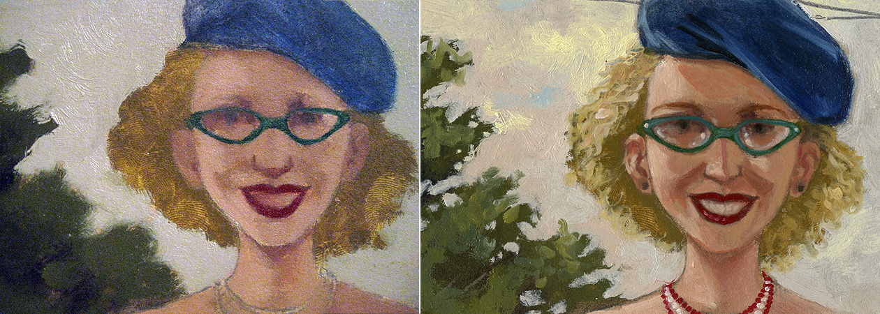
Besides, there's a part of me that always wondered what De Kooning's women would look like in person. In this case, are those her eyes, or could they be horn rimmed glasses? What's the slather or greenish blue sitting off-kilter above her head? Is that a squiggle of blond hair off to the right?

Does she have a rainbow boob tattoo?


After finishing and tweaking the drawing, I scan and print it to a size that seems comfortable to paint. I tend to do a test print of the most challenging area (usually the head) to see what the scale looks like in real life, and if I think I can paint it that large/small, I go ahead and rescale the whole shebang to match. 


The drawing is transferred to primed paper, either Fabriano 140 lb. soft press watercolor paper or Rives BFK printmaking paper. In this case, we're on Rives, at about 15" x 22".


 A wash of burnt umber is laid down over the entire image. This keeps the ensuing colors from looking scary against what would otherwise be a glaring white, which as a glaring white can make even a swipe of pale lavender look awfully dark. There's no sense in making oneself gun shy at the first stroke of paint.


Using a palette of Titanium White, Cadmium Yellow Light,  Yellow Ochre, Cadmium Red Light, Alizarin Crimson, Ultramarine Blue, Cerulean Blue, Sap Green and a small glob of Burnt Sienna, I mix up a glob of black (using the Alizarin and Sap Green...this is pretty much Sap Green's only job). I then get going blocking in large swaths of color and value, going roughly from dark to light and neutral to more saturated.

Once the whole of the image has been blocked in, I leave it for a day or two to dry. Colors get thinned with either Galkyd or a combination of thickened linseed oil, Venice turpentine (contributes leveling qualities to the paint, which I've adopted to make scanning things easier in my professional work) and turpentine, occasionally with the addition of Damar varnish to the mix. If this is the medium I'm using, I'll swirl in a tiny dot of Cobalt drier.

Brushes are a mix of 1/2 inch and 1/4 inch flats, filberts that used to be flats, and small sable filbert for the little stuff.


Once we're all dry, I go back in, brightening and shifting colors and fleshing out details. Sometimes the second coat of paint is scumbled, sometimes it's heaped on, and other times the underpainting gets a thin, thin coat of medium to make the subsequent layer go down with a touch more control and softer edges. Every now and then, some area takes on a glaze of Alizarin mixed with Viridian or Burnt Sienna tinted with Sap Green.


So here's our gal. And I guess she does have a rainbow boob tattoo. With a My Pretty Pony cantering happily in the foreground.