Showing posts with label teaching. Show all posts

Saturday, May 4, 2013

Another semester, another string o' demos

So, let's start of with the weird ones.

Really, they'd be more aptly labeled the "economical" or "versatile" demos. 

This little feller, for instance, started life out as a still life demo, specifically a still life of a pear. He went on to find employment as a skin tone mixing demo, whereupon he found himself sitting in the midst of a cloud demo which soon developed into a landscape demo. You see? He's not that weird after all.


Up next is François the Impressionist Man Boy. He began life as a demo on the proportions of a child, but several months later reappeared to assist in a demo about skin tone mixing techniques and lighting on facial hair. I'd like to say that, like pear man above, he's marked more by versatility than sheer weirdness, but no, he's weird. Like, don't-make-eye-contact-with-him weird.


That's it for the oddities. We're now up to some academic nudes, rendered in pencil and white gouache on toned paper. Various sizes.


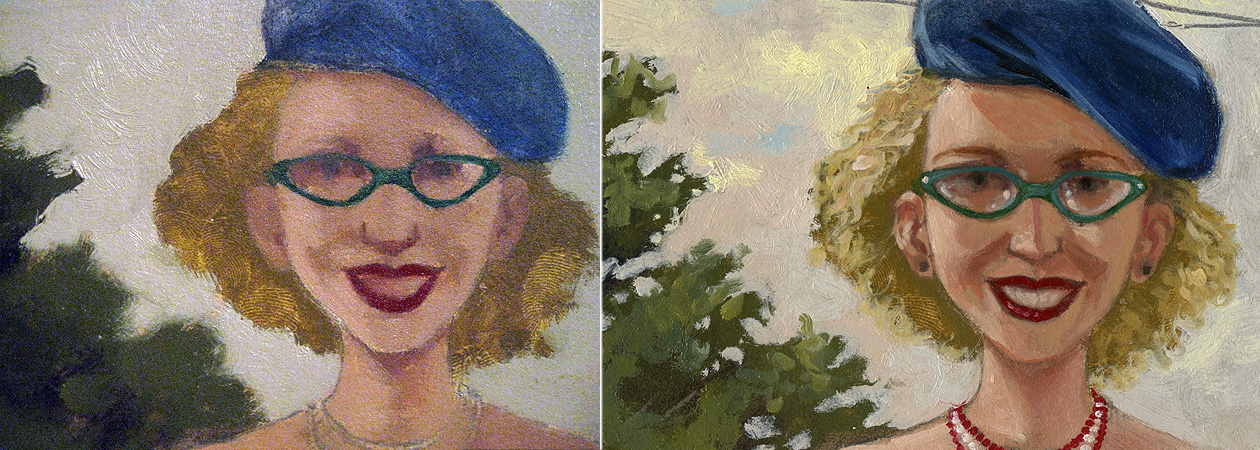
 Some one hour oil painting demos. These are all completed on either canvas or primed paper, between 11" x 14" and 13" x 19".


And these last two chaps are little one hour demonstrations of what we in illustration affectionately refer to as "the C. F. Payne technique," though it has been used pretty broadly by Mark English and others as well, and to remarkably different effect. 


Demo Guy is one of the world's more unsung supervillains, if such a phrase exists. His only known superpower is a seemingly limitless supply of patience, which is of surprisingly little use in the superhero arena. As a supervillain, though, he has essentially donated his body to the whims of other villains as they work out the kinks in their freeze rays, paralyzing gazes, or—in this case—updates in their makeup regimes.


Thursday, December 20, 2012

The semester in demos

A selection of one hour oil painting demos from this past Fall semester at the University of the Arts.

Various supports (paper, canvas...),
various sizes,
various levels of success...


Thursday, March 15, 2012

What kind of lady wears a necklace that matches her smile, anyway?


 Ohhh, that kind of lady.

So it's oil painting demo time at the University of the Arts. There is a sophomore tradition of reinterpreting an Old Master's painting in some way, shape or form that comes around every Spring semester, and so for fun I've been taking it upon myself to combine that particular idea with a demonstration of oil painting technique, in part to illustrate just how literally or conceptually I'm content to let the assignment progress.

Besides, there's a part of me that always wondered what De Kooning's women would look like in person. In this case, are those her eyes, or could they be horn rimmed glasses? What's the slather or greenish blue sitting off-kilter above her head? Is that a squiggle of blond hair off to the right?

Does she have a rainbow boob tattoo?


After finishing and tweaking the drawing, I scan and print it to a size that seems comfortable to paint. I tend to do a test print of the most challenging area (usually the head) to see what the scale looks like in real life, and if I think I can paint it that large/small, I go ahead and rescale the whole shebang to match. 


The drawing is transferred to primed paper, either Fabriano 140 lb. soft press watercolor paper or Rives BFK printmaking paper. In this case, we're on Rives, at about 15" x 22".


 A wash of burnt umber is laid down over the entire image. This keeps the ensuing colors from looking scary against what would otherwise be a glaring white, which as a glaring white can make even a swipe of pale lavender look awfully dark. There's no sense in making oneself gun shy at the first stroke of paint.


Using a palette of Titanium White, Cadmium Yellow Light,  Yellow Ochre, Cadmium Red Light, Alizarin Crimson, Ultramarine Blue, Cerulean Blue, Sap Green and a small glob of Burnt Sienna, I mix up a glob of black (using the Alizarin and Sap Green...this is pretty much Sap Green's only job). I then get going blocking in large swaths of color and value, going roughly from dark to light and neutral to more saturated.

Once the whole of the image has been blocked in, I leave it for a day or two to dry. Colors get thinned with either Galkyd or a combination of thickened linseed oil, Venice turpentine (contributes leveling qualities to the paint, which I've adopted to make scanning things easier in my professional work) and turpentine, occasionally with the addition of Damar varnish to the mix. If this is the medium I'm using, I'll swirl in a tiny dot of Cobalt drier.

Brushes are a mix of 1/2 inch and 1/4 inch flats, filberts that used to be flats, and small sable filbert for the little stuff.


Once we're all dry, I go back in, brightening and shifting colors and fleshing out details. Sometimes the second coat of paint is scumbled, sometimes it's heaped on, and other times the underpainting gets a thin, thin coat of medium to make the subsequent layer go down with a touch more control and softer edges. Every now and then, some area takes on a glaze of Alizarin mixed with Viridian or Burnt Sienna tinted with Sap Green.


So here's our gal. And I guess she does have a rainbow boob tattoo. With a My Pretty Pony cantering happily in the foreground.


Tuesday, December 6, 2011

Must be the time of the year for demos.

Just a few...


The oil paintings were attempted during the community college Art Appreciation classes I teach in Paterson, NJ, while the black and white acrylic number was for my sophomore level Pictorial Foundation section at the University of the Arts in Philadelphia.

Each demo was completed in just about an hour; the oils are of students in each respective class, and the black and white piece completed from a scrap of photo reference, originally taken for another project.

All the demos in this batch were done without any preliminary pencil drawings, just attacked with a brush from the start. The oils were completed using a limited palette of titanium white, cadmium yellow light, yellow ochre, cadmium red light, permanent alizarin crimson, ultramarine blue and cerulean blue, with some sap green thrown in for mixing up blacks and some burnt umber to tone the support. They're painted on canvas, linen, and prepared paper, respectively. The acrylic piece was completed on an acrylic primed sheet of Fabriano Soft Press 140 lb watercolor paper.

I should probably put a step by step at some point, but for now finishing an image with a dozen or so students huddled around might have been miraculous enough...

In other related news, this Friday, the 9th of December, I'm looking forward to conducting an after school oil painting workshop at Millburn High School here in NJ, working from a model and broken up into a one hour demo and two hours of supervised painting on the part of the students.


Tuesday, May 17, 2011

A little ol' workshop.

oil on canvas, 14"x18"

This past Friday, I was invited into Millburn High School, in Millburn, NJ, to conduct an oil painting demo and workshop, for what I can only describe as the most enthusiastic and attentive group of students I've ever been in front of. The model originally booked for the afternoon had to cancel, and this young lady volunteered to hold her pose for the four hours I was there. 

Not counting the "let's let the model stretch out her back muscles so she neither faints nor atrophies" breaks, she sat as still as a statue, and every time she returned to her pose, even the little dot of light hitting the far corner of her mouth was in place.  She really did a remarkable job.

Special thanks to Kathleen Harte-Gilsenan for putting the whole thing together, and particularly for amassing around her such an informed and passionate group of students.

 
photo: Kathleen Harte-Gilsenan

Monday, April 4, 2011

Painting Demo

It's an unofficial tradition at the University of the Arts in Philly to give sophomore illustration majors an "Old Masters" assignment, asking students to reinterpret a great work of art from antiquity, and to render it as close to the size of the original as possible.

Some highlights from my class this semester involved recasting Caravaggio's version of the "Judith beheading Holofernes" as a mural sized involuntary beard shaving, and Goya's "the Third of May, 1808" as a wet t-shirt contest. For my demonstration, I completely cheated, as is my prerogative as an instructor, and chose a small piece by Vermeer involving only one figure, "The Milkmaid." In my defense, though, it's a Vermeer, and no cheap impersonation or homage is ever as good as a Vermeer. Aside from the comparison it begs to its untouchable Dutch predecessor, I also think I lost a little of my young lady's quirkiness, present in the sketch, as I rushed through the oil painting. Character can be such a delicate issue; a few dabs of the right color wrong places, and the species and gender remain, but, nope, not the character.


But anyway, here's she is. The whole thing was handled in what I like to think of as the Julia Child method, where one starts a preliminary step, proceeds halfway through, then pulls out a earlier version to complete. In this case, there was a subdued "local color" underpainting in place, and the demo proceeding in two steps, the first of which was to lay down a thin glaze of sap green and burnt sienna over the whole thing, unifying the temperature throughout. The second step that proceeded involved about an hour of scumbling and building up lit surfaces in the composition, exploring chromatic changes that occur with the varying of paint's opacity when applied in successive layers.

Sounds pretty highfalutin, if you ask me.


Tuesday, November 30, 2010

For Demonstration Purposes Only.

It's that time of the semester when I find myself doing demos. Lots and lots of demos. So skipping over the one where I painted a tarnished brass frog sprinkler in blue and orange gouache to demonstrate a logical place for a complementary color scheme, here's a portrait of a student in my Art Appreciation class, executed over the course of an hour in class.

Fabiola, 2010.
oil on canvas, 11" x 16"


The following two were separate technique and color scheme demonstrations, based on a sketch from my "Mind Your Manners, Alice Roosevelt!" book. They're both variations on tertiary, triadic color schemes, one utilizing a combination of red-orange, yellow-green and blue-violet, while the other is comprised mainly of red-violet, yellow-orange, and blue-green.

Each of these took about an hour and a half to complete (thankfully, the sketching and reference had been taken care of two years ago). The watercolor was for my University of the Arts Pictorial Foundation class, while the gouache was for a Seton Hall University 2-D Color & Design section.


Watercolor on Fabriano 140 lb. soft press, 10.75" x 13"


Gouache on Arches 140 lb. hot press, 10.75" x 13"

Here's the original oil that appears in the book:

"She simply decided to spend her time over his roof." 2010.
Oil on paper, 18" x 30"

...and the original sketch...

"She simply decided to spend her time over his roof." 2008.
Pencil and white gouache on gray Canson paper, 11" x 19"