Showing posts with label process. Show all posts

Tuesday, October 24, 2017

There's going to be a mural...

So, I've been selected to create a mural for the Highland Avenue train station in Orange, NJ. The project is funded by a grant from the arts and urban renewal non-profit, H.A.N.D.S., and is being orchestrated by the kind, creative, and energetic folks at ValleyArts.

The plan I've concocted looks a bit like this:


And the proposal reads like this:

References to the Valley’s industrial past as an epicenter of hat making are to be found throughout our area. It is the intention of my mural design to take the nostalgia for our district’s manufacturing past and use it as a lens through which to view our current richness of cultural diversity. Proceeding from right to left as the dedicated wall space increases, a line of people appear, larger than life but as if descending the staircase from a sepia toned past to a full color present, using a plurality of headwear to tie the two together while highlighting their contrasts. In the background, the same sepia fades to a brilliant orange, overlaid with collaged imagery from early 20th century felt hat catalogs.

By concentrating on the varied hats, scarves and wraps, we can detect hints at each person's ethnic or religious background, but each is a portrait of individuality that ultimately obscures any reference to socioeconomic status, profession, or place of origin. Each hat represents a link to a history that may even predate the fedoras and feathers of the past, while still holding onto its own modern relevance.

MEDIUM AND PRODUCTION:
The proposed mural does not make any overt reference to the visual art or music performance aspect of our current Valley. This is by design; art about art can run the risk of patting itself on the back, and I have found my own work to be at its best when the art serves to communicate outside of itself. My intention is to produce the mural as a painting on or affixed to the supplied metal panels, with the intention of celebrating our area with an actual painting, as opposed to a printed reproduction. Our world is full of reproductions, whether in the form of print media, digital streaming, or television, with paintings, orchestras, and theater prohibitively expensive, contributing to an ever widening class division.

More soon!


Monday, May 15, 2017

Feral Town

For the past two years, I've taken up drawing on post-its notes.


The original idea was to do something creative with little passing thoughts I had, in an immediate context, with the time I had available. I would scribble them out between teaching obligations, for the most part.


The whole thing hinged upon working on something that wouldn't turn into work. I've so far thought up and drawn over 400 of them.


So much for not turning it into work.


So I began making drypoint etchings of the series. I'd previously tried doing little gouache paintings of them, but they just took on an air of seriousness that worked against them. In paint they became meaner, and their cynicism turned into outright pessimism.

But the drypoints, for some reason, seem to work, and seem to retain a sense of directness without being too heavy. This is important in my little suburb of animalian dysfunction; I'd like it to be clear that I'm not wishing any of these little guys any ill will. I'm glad Maureen and Tom can work things out in their own hamster way.

A few have been making their way into the Monday edition of The Atticus Review, an online literary magazine edited by author and photographer David Olimpio.

You can also see most of the whole ongoing shebang on Instagram.


More to come... and maybe a shopping option.

Wednesday, August 17, 2016

A Thing In The Works

Not revealing much about this one yet, either, but here's a start. I'd like to thank eBay for helping me find just the right period train seat, complete with its original upholstery.


 thumbnail, pencil on paper

  sketch/value study, colored pencil and gouache on paper

final art, oil on prepared paper

Friday, June 10, 2011

Cobbled together.

15" x 22," oil on paper.

I still can't tell you much about this project, except that it comes out next year, and the main character is not a croquet prodigy who interns in his youth as an apothecary. 


Tuesday, May 17, 2011

A little ol' workshop.

oil on canvas, 14"x18"

This past Friday, I was invited into Millburn High School, in Millburn, NJ, to conduct an oil painting demo and workshop, for what I can only describe as the most enthusiastic and attentive group of students I've ever been in front of. The model originally booked for the afternoon had to cancel, and this young lady volunteered to hold her pose for the four hours I was there. 

Not counting the "let's let the model stretch out her back muscles so she neither faints nor atrophies" breaks, she sat as still as a statue, and every time she returned to her pose, even the little dot of light hitting the far corner of her mouth was in place.  She really did a remarkable job.

Special thanks to Kathleen Harte-Gilsenan for putting the whole thing together, and particularly for amassing around her such an informed and passionate group of students.

 
photo: Kathleen Harte-Gilsenan

Monday, April 4, 2011

Painting Demo

It's an unofficial tradition at the University of the Arts in Philly to give sophomore illustration majors an "Old Masters" assignment, asking students to reinterpret a great work of art from antiquity, and to render it as close to the size of the original as possible.

Some highlights from my class this semester involved recasting Caravaggio's version of the "Judith beheading Holofernes" as a mural sized involuntary beard shaving, and Goya's "the Third of May, 1808" as a wet t-shirt contest. For my demonstration, I completely cheated, as is my prerogative as an instructor, and chose a small piece by Vermeer involving only one figure, "The Milkmaid." In my defense, though, it's a Vermeer, and no cheap impersonation or homage is ever as good as a Vermeer. Aside from the comparison it begs to its untouchable Dutch predecessor, I also think I lost a little of my young lady's quirkiness, present in the sketch, as I rushed through the oil painting. Character can be such a delicate issue; a few dabs of the right color wrong places, and the species and gender remain, but, nope, not the character.


But anyway, here's she is. The whole thing was handled in what I like to think of as the Julia Child method, where one starts a preliminary step, proceeds halfway through, then pulls out a earlier version to complete. In this case, there was a subdued "local color" underpainting in place, and the demo proceeding in two steps, the first of which was to lay down a thin glaze of sap green and burnt sienna over the whole thing, unifying the temperature throughout. The second step that proceeded involved about an hour of scumbling and building up lit surfaces in the composition, exploring chromatic changes that occur with the varying of paint's opacity when applied in successive layers.

Sounds pretty highfalutin, if you ask me.


Tuesday, October 21, 2008

A trip into the studio.


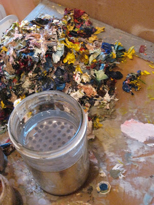
Ah, for starters, we have an empty mushroom can, punched through multiple times with a nail, submerged in a Ball mason jar of odorless paint thinner. This allows for sediment to settle (cheaply) to the bottom as brushes are cleaned against the perforations. In the background is my ubiquitous pile of paint scraped from the palette.
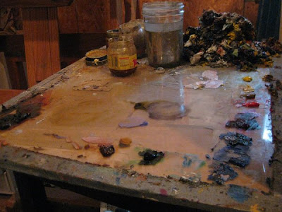

The palette itself is a sheet of masonite topped with a sheet of glass, amply duct taped around the edges and propped on top of an end table. The idea here is that the masonite will provide a nice neutral—a (rather warm) 50% gray—upon with to mix colors, lending a sense of relativity to the values and intensities mixed up. The glass allows for smooth cleanup with a razor blade.

I tend to use, in light to dark rainbow order, toothpaste-sized globs of Titanium White, Cadmium Yellow Light, Naples Yellow (occasionally), Yellow Ochre, Cadmium Red Light, Quinacridone Rose, Permanent Alizarin Crimson (dries faster and is more lightfast than regular A.C.), Ultramarine Blue Deep, Cobalt Blue, Cerulean Blue, Sap Green, and a guest appearance at the end by Transparent red earth. Occasionally burnt umber and Prussian Blue get to sit in, too.

It would be awful nice if I'd ever gotten around to puttying and painting my walls/ceiling up here, but somewhere in the middle of racing to finish an attic studio, a kitchen, and a nursery in our house, my first son was born. So I now just try to keep in mind that the particle board walls here (couldn't get sheet rock up the narrow, twisting stairs) make the light exceeding warm when I'm mixing colors, and adjust accordingly through the magic of unscientific guestimation.

So, here's the book sketch I'm working from at the moment:
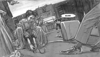

...which was assembled from fair amount of period photo reference, building floorplans, ebay auction photos, and reference photos of a student of mine, dressed in $60 worth of (ebay) hundred year old clothing, cross referenced with other photographic period clothing reference.
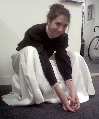

Halfway through our photoshoot, my good camera died, leaving me with only my phone to finish up with. Sooo professional.

The sketch was then printed up at about 150% (the heads were comfortable to draw and paint at that scale...) and transfered via a light table to Fabriano soft press watercolor paper, which had been treated with a 50/50 solution of PVA adhesive and water, leaving it impervious to the elements but still feeling like paper.
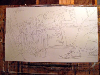

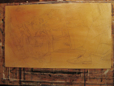
Everything is then toned with a wash of either burnt umber or burnt sienna:

Working in blocks of minimally modeled, muted local color to establish shadows and midtones, the painting is blocked in, usually over about 4-8 hours. I'm thinning the paints with a combination of turpentine, thickened linseed oil, and venice turpentine, which imparts a fairly impasto-free (no lumps), smooth surface, due to the venice turpentine's tendency to "level," or flatten out once applied.

When painting for reproduction, I've found this can help limit reflections and unpredictable sheen when the scanning is done. Thickened linseed oil (I usually use Winsor Newton's) is already half polymerized, which, while making it more viscous, also speeds along dry time.

I typically add a few drops (literally) of cobalt drier to the mix, after which the underpainting will be dry to the touch and ready for a second coat in about 24 hours.
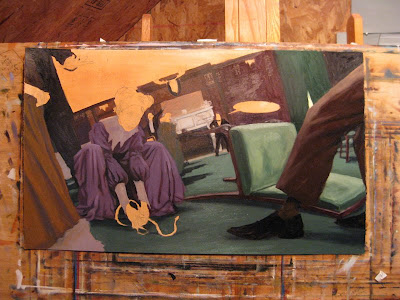

I have in the past started with faces, following advice I received once that if one screws up the face, there's really no point in finishing. This can make the portrait aspect of the painting too "sacred" right off the bat, at least in my case, so I like to get a bit of the atmosphere and temperature nailed down first.
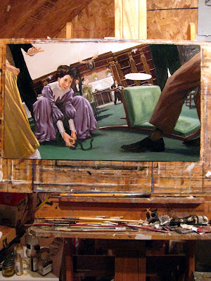
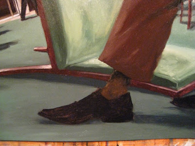
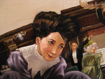
Then I break out the little brushes. I'd still hesitate to say I'm erring on the side of detailed realism; for the most part, my surfaces never transcend from being paint into, say, satin, wood or hair. When the size 1 round brush comes in, it spends a lot of time just cleaning up edges and producing smaller matrices of painterly dabs and blobs. A lot of time gets spent hiding colors inside of each other, trying to play up coloristic temperature shifts to activate as much of the paint surface as possible.

The entire project won't be due for another month or two, so I'll keep this painting out and visible while continuing to work on the remaining spreads and spots, checking character consistency and attending to occasional tweaks.
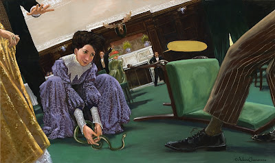

oil on paper, 17.75 x 30. 2008.