Tuesday, October 24, 2017

There's going to be a mural...

So, I've been selected to create a mural for the Highland Avenue train station in Orange, NJ. The project is funded by a grant from the arts and urban renewal non-profit, H.A.N.D.S., and is being orchestrated by the kind, creative, and energetic folks at ValleyArts.

The plan I've concocted looks a bit like this:


And the proposal reads like this:

References to the Valley’s industrial past as an epicenter of hat making are to be found throughout our area. It is the intention of my mural design to take the nostalgia for our district’s manufacturing past and use it as a lens through which to view our current richness of cultural diversity. Proceeding from right to left as the dedicated wall space increases, a line of people appear, larger than life but as if descending the staircase from a sepia toned past to a full color present, using a plurality of headwear to tie the two together while highlighting their contrasts. In the background, the same sepia fades to a brilliant orange, overlaid with collaged imagery from early 20th century felt hat catalogs.

By concentrating on the varied hats, scarves and wraps, we can detect hints at each person's ethnic or religious background, but each is a portrait of individuality that ultimately obscures any reference to socioeconomic status, profession, or place of origin. Each hat represents a link to a history that may even predate the fedoras and feathers of the past, while still holding onto its own modern relevance.

MEDIUM AND PRODUCTION:
The proposed mural does not make any overt reference to the visual art or music performance aspect of our current Valley. This is by design; art about art can run the risk of patting itself on the back, and I have found my own work to be at its best when the art serves to communicate outside of itself. My intention is to produce the mural as a painting on or affixed to the supplied metal panels, with the intention of celebrating our area with an actual painting, as opposed to a printed reproduction. Our world is full of reproductions, whether in the form of print media, digital streaming, or television, with paintings, orchestras, and theater prohibitively expensive, contributing to an ever widening class division.

More soon!


Tuesday, July 25, 2017

Counting down

Well, just another week till Ludy hits the shelves. In the mean time,  Kirkus Reviews had some nice things to say.

"Patrick's folksy account is crisp and packed with facts. Gustavson's evocative illustrations combine oil paintings with gouache on watercolor paper, painting Ludy as a gangly beanpole with an enormously expressive face."—Kirkus


Monday, May 15, 2017

Feral Town

For the past two years, I've taken up drawing on post-its notes.


The original idea was to do something creative with little passing thoughts I had, in an immediate context, with the time I had available. I would scribble them out between teaching obligations, for the most part.


The whole thing hinged upon working on something that wouldn't turn into work. I've so far thought up and drawn over 400 of them.


So much for not turning it into work.


So I began making drypoint etchings of the series. I'd previously tried doing little gouache paintings of them, but they just took on an air of seriousness that worked against them. In paint they became meaner, and their cynicism turned into outright pessimism.

But the drypoints, for some reason, seem to work, and seem to retain a sense of directness without being too heavy. This is important in my little suburb of animalian dysfunction; I'd like it to be clear that I'm not wishing any of these little guys any ill will. I'm glad Maureen and Tom can work things out in their own hamster way.

A few have been making their way into the Monday edition of The Atticus Review, an online literary magazine edited by author and photographer David Olimpio.

You can also see most of the whole ongoing shebang on Instagram.


More to come... and maybe a shopping option.

Tuesday, April 4, 2017

"Swimmers" Exhibition Opens April 6!

The Maplewood, NJ, exhibition will feature fifteen paintings from the ongoing series. And probably some cheese cubes and wine.


Swimmer (Oxygen), 2017. Oil on Canvas.


Swimmer (Tremor), 2017. Oil on Canvas.


Swimmer (Orange disintegrate), 2017. Oil on Canvas.

Wednesday, March 1, 2017

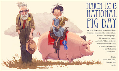
March 1st is National Pig Day


...and even though he'd won second place,
Francisco considered the contest a bust.
He spoke seven languages.
He was a chess master.
And yet he'd been bested by
a Yorkshire named Mr. Taco
in what turned out to be
a glorified eating
competition.

Darla,
on the other hand,
beamed with
pride.

Sunday, February 19, 2017

Stand Up And Sing!


Stand Up And Sing! is my latest collaboration with author Susanna Reich. It's the story of folk singer, activist, environmentalist, and erstwhile shipbuilder Pete Seeger, from his birth in 1919 to his passing in 2014, complete with forays into the labor movement, McCarthyism, the Civil Rights era, and the founding of the Clearwater organization.

Publisher's Weekly just had these kind words to say about it:

Reich and Gustavson, who previously collaborated on Fab Four Friends, deliver a rich portrait of musician and activist Pete Seeger, focusing on how his deeply held convictions galvanized his music. Gustavson’s mixed-media illustrations highlight Seeger’s modest upbringing and down-to-earth persona, pairing lushly illustrated scenes of him traveling and performing with rough, loose sketches of unemployed men lined up for free food during the Great Depression, a couch where Seeger rested while on tour, and soldiers wading through a river in Vietnam (Seeger was outraged when one of his protest songs, “Waist Deep in the Big Muddy,” was cut from a television appearance). It’s an intimate look at a pivotal American figure who saw himself, as Reich notes, as a link in “a chain in which music and social responsibility are intertwined.” Ages 6–9. Author’s agent: Edward Necarsulmer IV, Dunow, Carlson & Lerner. Illustrator’s agent: Abigail Samoun, Red Fox Literary. (Mar.)


The artwork for the book takes a couple directions, medium-wise. I wanted the backgrounds to have a texture reminiscent of a calfskin banjo head, something accomplished with thinned down oil paint on prepared paper and a lot of trial and error. 


The full color art is painted in gouache, but I wanted the spot art to have a sense of immediacy, functioning as little passing details to land on through the storytelling, but not things to be lingered on much. Pete's life story is rich in experiences, and the varied visual approach is an attempt to fit as much in as possible, while helping to prioritize and elevate some details above others. It also serves to provide a rhythm to the narrative, something that can be a challenge in nonfiction (life events don't care if they happen in a convenient story arc, and sometimes need to be coaxed a bit). 


Nailing down a consistent likeness for a protagonist who ages 90+ years in the course of a tale is in itself a very specific challenge. My previous book with Susan, Fab Four Friends, had similar challenges, and getting things to feel right without giving the art a stiff or self-conscious quality is a real balancing act. In both books, the characters, period details of their surroundings, and their relationships to their specific instruments through the years all had to be delicately shoehorned into compositions that first and foremost served the story, hopefully stripping away some mystique from cultural icons in service of empathy.


(And while some instances of reference hunting reveal precise details, like the color of the anti-macassars on Paul's mom's couch here, other elements are informed by odd tidbits of outside knowledge, like the fugitive quality of red dye used in cheap guitars from the fifties, which makes them appear more neutral or greenish in their present form.)