Thursday, March 15, 2012

What kind of lady wears a necklace that matches her smile, anyway?


 Ohhh, that kind of lady.

So it's oil painting demo time at the University of the Arts. There is a sophomore tradition of reinterpreting an Old Master's painting in some way, shape or form that comes around every Spring semester, and so for fun I've been taking it upon myself to combine that particular idea with a demonstration of oil painting technique, in part to illustrate just how literally or conceptually I'm content to let the assignment progress.

Besides, there's a part of me that always wondered what De Kooning's women would look like in person. In this case, are those her eyes, or could they be horn rimmed glasses? What's the slather or greenish blue sitting off-kilter above her head? Is that a squiggle of blond hair off to the right?

Does she have a rainbow boob tattoo?


After finishing and tweaking the drawing, I scan and print it to a size that seems comfortable to paint. I tend to do a test print of the most challenging area (usually the head) to see what the scale looks like in real life, and if I think I can paint it that large/small, I go ahead and rescale the whole shebang to match. 


The drawing is transferred to primed paper, either Fabriano 140 lb. soft press watercolor paper or Rives BFK printmaking paper. In this case, we're on Rives, at about 15" x 22".


 A wash of burnt umber is laid down over the entire image. This keeps the ensuing colors from looking scary against what would otherwise be a glaring white, which as a glaring white can make even a swipe of pale lavender look awfully dark. There's no sense in making oneself gun shy at the first stroke of paint.


Using a palette of Titanium White, Cadmium Yellow Light,  Yellow Ochre, Cadmium Red Light, Alizarin Crimson, Ultramarine Blue, Cerulean Blue, Sap Green and a small glob of Burnt Sienna, I mix up a glob of black (using the Alizarin and Sap Green...this is pretty much Sap Green's only job). I then get going blocking in large swaths of color and value, going roughly from dark to light and neutral to more saturated.

Once the whole of the image has been blocked in, I leave it for a day or two to dry. Colors get thinned with either Galkyd or a combination of thickened linseed oil, Venice turpentine (contributes leveling qualities to the paint, which I've adopted to make scanning things easier in my professional work) and turpentine, occasionally with the addition of Damar varnish to the mix. If this is the medium I'm using, I'll swirl in a tiny dot of Cobalt drier.

Brushes are a mix of 1/2 inch and 1/4 inch flats, filberts that used to be flats, and small sable filbert for the little stuff.


Once we're all dry, I go back in, brightening and shifting colors and fleshing out details. Sometimes the second coat of paint is scumbled, sometimes it's heaped on, and other times the underpainting gets a thin, thin coat of medium to make the subsequent layer go down with a touch more control and softer edges. Every now and then, some area takes on a glaze of Alizarin mixed with Viridian or Burnt Sienna tinted with Sap Green.
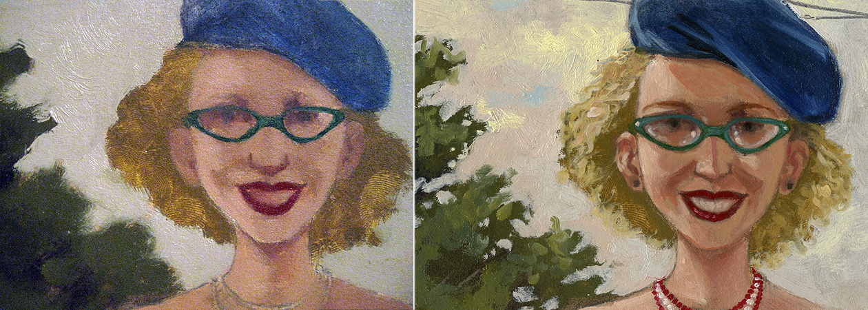


So here's our gal. And I guess she does have a rainbow boob tattoo. With a My Pretty Pony cantering happily in the foreground.


Friday, February 3, 2012

Oh, it's a new headshot thingee.

After sending off what was apparently the same photo to publishers for ten years, we here in the Adam Gustavson camp decided it was time for a new picture.

So here it is, photo courtesy of my lovely wife.

Of course, you're invited to troll through the blog to see where that other guy reappears. And if you should find him, it may also be worth knowing that he answers to the name "Mr. Scrapple."

The decorative backdrop behind us is the 2' x 4' piece of plywood upon which I've tacked up and painted most of these past eleven years' worth of work.


And by "troll," of course, I mean "lazily cast about though" and not "leave me mean comments using the interactive features of this minicyberwonderland," though I'm by no means saying I'd try to stop you. Carry on.

Tuesday, December 6, 2011

Must be the time of the year for demos.

Just a few...


The oil paintings were attempted during the community college Art Appreciation classes I teach in Paterson, NJ, while the black and white acrylic number was for my sophomore level Pictorial Foundation section at the University of the Arts in Philadelphia.

Each demo was completed in just about an hour; the oils are of students in each respective class, and the black and white piece completed from a scrap of photo reference, originally taken for another project.

All the demos in this batch were done without any preliminary pencil drawings, just attacked with a brush from the start. The oils were completed using a limited palette of titanium white, cadmium yellow light, yellow ochre, cadmium red light, permanent alizarin crimson, ultramarine blue and cerulean blue, with some sap green thrown in for mixing up blacks and some burnt umber to tone the support. They're painted on canvas, linen, and prepared paper, respectively. The acrylic piece was completed on an acrylic primed sheet of Fabriano Soft Press 140 lb watercolor paper.

I should probably put a step by step at some point, but for now finishing an image with a dozen or so students huddled around might have been miraculous enough...

In other related news, this Friday, the 9th of December, I'm looking forward to conducting an after school oil painting workshop at Millburn High School here in NJ, working from a model and broken up into a one hour demo and two hours of supervised painting on the part of the students.


Tuesday, October 4, 2011

Friday, September 23, 2011

September 24th is Fish Amnesty Day! Get a move on it!


No longer, Becky told herself,
would Mr. Squiggy be forced to circle
his tiny bowl of tepid tap water,
goggled by visitors and fed those small
factory made protein pellets.
No, for today he had been made free,
free to make his own choices, 
liberated from the stifling care
of his old home,
to chart his own course
and seek his own fortune.

Tuesday, September 6, 2011

In the New Stuff department...

This Fall, I'll have two new titles out, Jingle Bells: How The Holiday Classic Classic Came To Be, by John Harris and published by Peachtree, and Better Than You, a new collaboration with Trudy Ludwig, author of Just Kidding. Originally slated for release by recently folded Tricycle Press, it will be published by Knopf, an imprint of Random House.

 From Jingle Bells, By John Harris. Peachtree Publishers, 2011. Oil on Paper. 
From Jingle Bells, By John Harris. Peachtree Publishers, 2011. Oil on Paper. 

 From Better Than You, By Trudy Ludwig. Random House, 2011. Oil on Paper. 
 From Better Than You, By Trudy Ludwig. Random House, 2011. Gouache on Paper. 

New things are also afoot, and while I can't divulge much, I will leave you with this tidbit... and while I still cannot avail further details or specifics, I can relate at the very least that the protagonist is not, in fact, the stuffed flying badger.


Also coming down the proverbial pike is the corresponding title to this recently completed painting for Lee and Low...

...a 22" x 30" oil on paper for a book that is not about 19th century competitive bocce ball.


Friday, July 8, 2011

Who is this guy?


Well, for now his identity is classified, but he's definitely not the world's first major league deaf baseball player.

And while I can't divulge his identity at this point, I'll be posting further updates on his travails as his Fall 2012 world debut approaches. No action figures are in the works right now, but you can see why I might want one.


IN OTHER NEWS, I was recently profiled and interviewed by the Society of Children's Book Writers and Illustrators NJ chapter regional adviser and all around go-getter Kathy Temean, and will be participating in the NJ SCBWI November 5th-6th Craft Day at the Princeton Hyatt Regency, with an oil paintin' workshop on Saturday, and sticking around to participate in their Illustrators' Day Mentoring Workshop on Sunday.

The whole kit and caboodle and be found here:
http://kathytemean.wordpress.com/2011/07/02/illustrator-saturday-adam-gustavson/
