Ohhh, that kind of lady.
So it's oil painting demo time at the University of the Arts. There is a sophomore tradition of reinterpreting an Old Master's painting in some way, shape or form that comes around every Spring semester, and so for fun I've been taking it upon myself to combine that particular idea with a demonstration of oil painting technique, in part to illustrate just how literally or conceptually I'm content to let the assignment progress.
Besides, there's a part of me that always wondered what De Kooning's women would look like in person. In this case, are those her eyes, or could they be horn rimmed glasses? What's the slather or greenish blue sitting off-kilter above her head? Is that a squiggle of blond hair off to the right?
Does she have a rainbow boob tattoo?
After finishing and tweaking the drawing, I scan and print it to a size that seems comfortable to paint. I tend to do a test print of the most challenging area (usually the head) to see what the scale looks like in real life, and if I think I can paint it that large/small, I go ahead and rescale the whole shebang to match.
The drawing is transferred to primed paper, either Fabriano 140 lb. soft press watercolor paper or Rives BFK printmaking paper. In this case, we're on Rives, at about 15" x 22".
A wash of burnt umber is laid down over the entire image. This keeps the ensuing colors from looking scary against what would otherwise be a glaring white, which as a glaring white can make even a swipe of pale lavender look awfully dark. There's no sense in making oneself gun shy at the first stroke of paint.
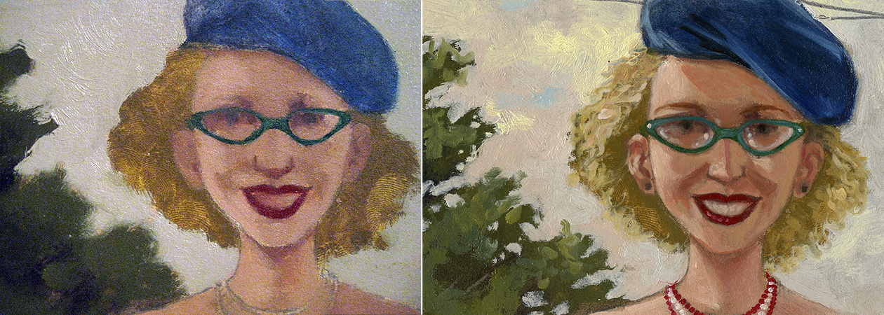
Using a palette of Titanium White, Cadmium Yellow Light, Yellow Ochre, Cadmium Red Light, Alizarin Crimson, Ultramarine Blue, Cerulean Blue, Sap Green and a small glob of Burnt Sienna, I mix up a glob of black (using the Alizarin and Sap Green...this is pretty much Sap Green's only job). I then get going blocking in large swaths of color and value, going roughly from dark to light and neutral to more saturated.
Once the whole of the image has been blocked in, I leave it for a day or two to dry. Colors get thinned with either Galkyd or a combination of thickened linseed oil, Venice turpentine (contributes leveling qualities to the paint, which I've adopted to make scanning things easier in my professional work) and turpentine, occasionally with the addition of Damar varnish to the mix. If this is the medium I'm using, I'll swirl in a tiny dot of Cobalt drier.
Brushes are a mix of 1/2 inch and 1/4 inch flats, filberts that used to be flats, and small sable filbert for the little stuff.
Once we're all dry, I go back in, brightening and shifting colors and fleshing out details. Sometimes the second coat of paint is scumbled, sometimes it's heaped on, and other times the underpainting gets a thin, thin coat of medium to make the subsequent layer go down with a touch more control and softer edges. Every now and then, some area takes on a glaze of Alizarin mixed with Viridian or Burnt Sienna tinted with Sap Green.
So here's our gal. And I guess she does have a rainbow boob tattoo. With a My Pretty Pony cantering happily in the foreground.